University Logo
Overview
The University of North Carolina at Chapel Hill logo is the keystone of our visual identity. This logo, or a University unit or department logo, should be used on all communications materials.
Using the logo consistently will enhance the recognition of the University by all audiences. The primary logo uses a horizontal layout and the secondary logo is centered in a vertical format. The primary logo should be the first choice when the University logo is used. When appropriate, it may be substituted with the secondary logo.
PRIMARY LOGO
![]()
SECONDARY LOGO
![]()
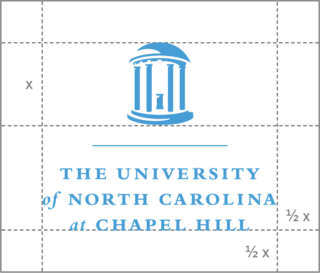
Clear Space Requirements
To ensure the integrity and visual impact of the logo, the appropriate “clear space” must be maintained on all sides. Specifically, where “x” is equal to the height of the Old Well icon, there must be a minimum of 1/2 the distance “x” between the outside edge of the logo and any other page element, including the edge of the page. The vertical line dividing “UNC” and the unit or department name may fall inside the clear space.
PRIMARY LOGO
![]()
SECONDARY LOGO
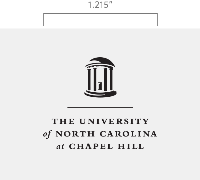
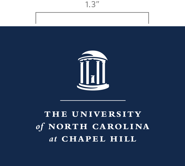
Size Requirements
The logo must be resized proportionally and in its entirety; therefore, measurements for all elements in the logo are relative to each other.
When PMS® 542 or black is used in printing the logo, the minimum width for the logo is 1.875 inches. When the logo appears as a white knockout on a color background, the minimum width is 2 inches. If a 4-color process build is used to print the logo, the minimum width is 2 inches.
PRIMARY LOGO


SECONDARY LOGO
Usage
- The logo must be reproduced from high-resolution digital artwork.
- As the primary graphic identity for the University, the formal logo (or official unit logo or department logo) must appear on all communications, including brochures, stationery, business cards and websites.
- The logo may not be reconstructed or altered in any way. This prohibition includes, but is not restricted to, type, the vertical line, outlines and embellishments. Do not create secondary logos, as this is confusing to audiences and dilutes our goal of creating a common, mutually reinforcing image.
- The logo may not be cut or cropped in any way.
Color Options
The University logo comes in three different colors: Carolina Blue, black and white.
PRIMARY LOGO


SECONDARY LOGO


Color and Logo Restrictions
- Do not change any colors of the logo.
- Do not screen any of the logo colors.
- Do not print the logo in black over a dark background.
- Do not print the reversed (white) logo onto a light or white background.
- Do not place the logo over a heavily patterned background.
Improper Logo Treatment
- Do not configure the elements into a different logo.
- Do not crop or remove any part of the logo.
- Do not distort the logo.
- Do not tilt the logo in any direction.
- Do not add any shadows, effects or other elements to the logo.
- Do not alter the proportions of the logo.
- Do not attach a program-level identification to the logo or attempt to create your own unit or department logo.
- Do not duplicate any part of the logo to create a pattern.
- Do not recreate the type or substitute another typeface.
- Do not surround the logo with other competing shapes.
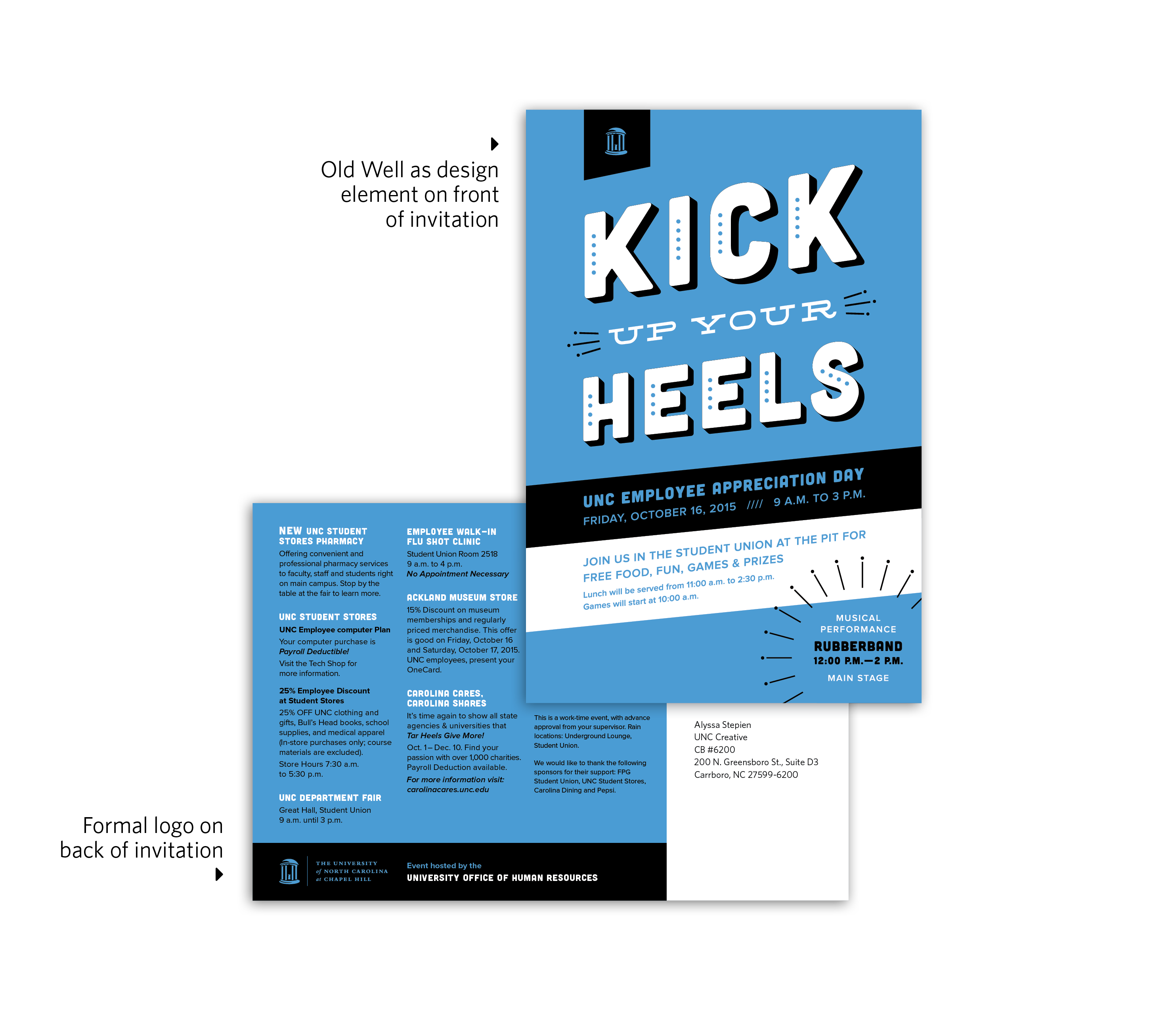
Logo Mark
The Old Well, as pictured below, is the only acceptable logo mark. It may not be reconstructed or altered in any way. This logo mark may be used as a design element separate from the formal logo only if the formal logo appears elsewhere on the printed or digital piece. See examples for clarification.

Contact
For more information about logo usage requirements, contact University Communications.